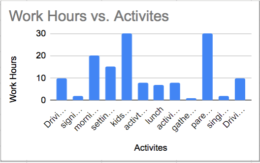

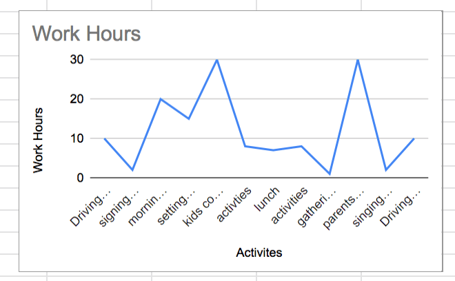
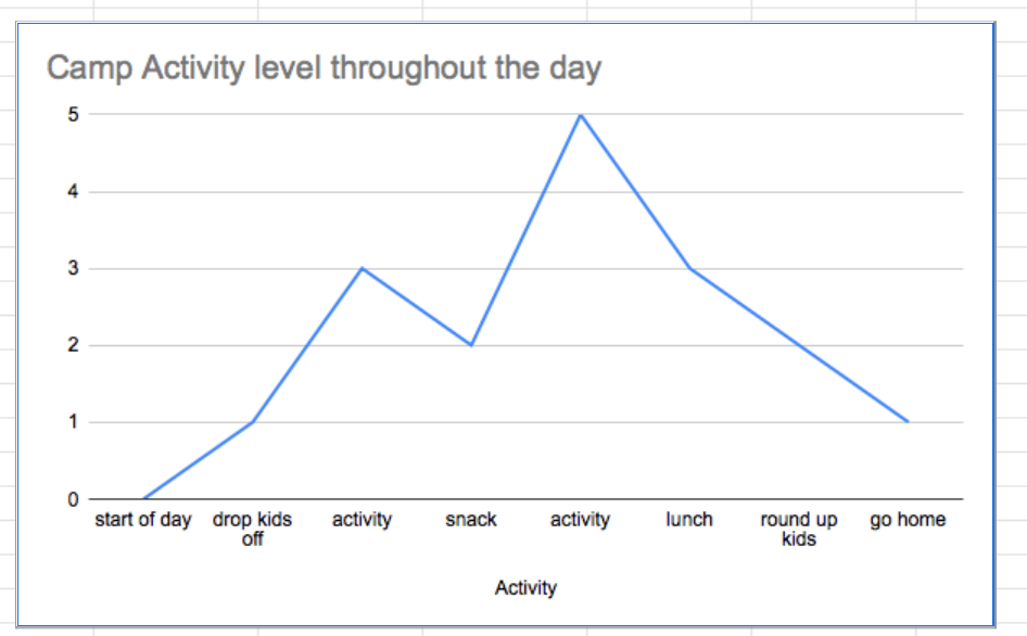
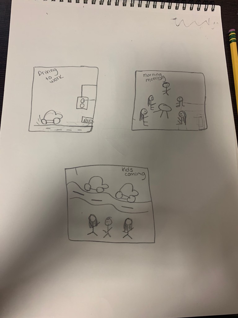
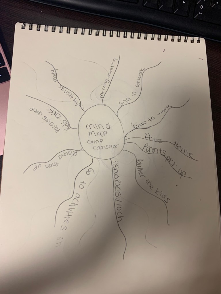
My Key message for people is that learning skills and coping with them are hard for many of us and that’s okay. What is most interesting about my skills for most people to know about is that I have a hard time with keeping all of the same skills but, I have learned that it is a big challenge for a lot of us to handle so many different kinds of skills in life. The five visualizations I have chosen to support my storytelling is that they match with the time of day and how my schedule works throughout the summer and having to deal with a part time job can be tough because there is so much you could do and to get done and hopefully someone can follow the schedule simply and easily. I think what people see first is the bar graphs and the pie chart is most important because is shows the data and the percentages of how many hours a day I spend with children and that is a skill because most people or parents have a hard time spending twenty-four hours with their kids when I spend eight hours of the day with them. My call to action is trying to get someone to hire me and get a job. I didn’t include any social media links so that my audience can follow up on the jobs and skills that I am doing. I was trying to achieve the skills that I most good at and how to create a resume with all the info about me and that I was trying to come up. My AHA Moment! Is that when I was trying to do my resume and I found that it was funny that I didn’t realize that it didn’t have many percentages or a bit of description about me but I think next time I will definitely have more information about myself and my job to. Also what I learned from this is that it is very important to make these kind of charts because you want to know about what your data is on the jobs and charts. The connections that I had made to the connections that I have made in class is that we did kind of the same thing for resumes in class. We also kept doing infographics. If I had more time in doing this project and resources I would definitely had colored my pictures in more. I would also take my time on the resume and do so much better and have it all completed. I think this last project was very interesting to do although it took so much time but it was really good to learn and think about what topics and interesting facts that I have learned about. I also would of definitely took more time on the pie chart and the X- axis doing more numbers and typing more of the data out and also having accurate feedback for the infographic and the charts.
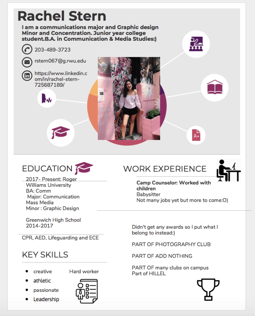
https://infograph.venngage.com/view/19629e98-f4a7-44fc-9f89-194c64df637f This is my Resume
