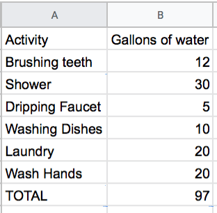

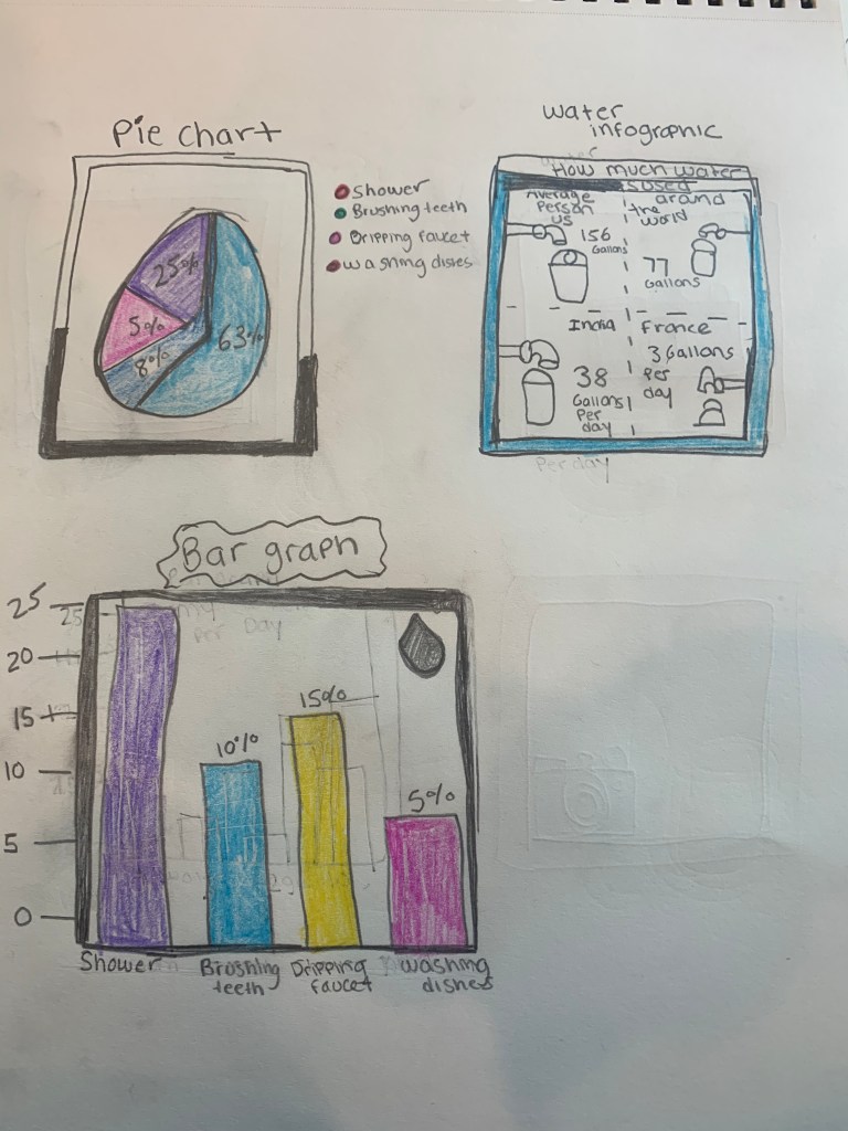


I chose to observe my water consumption over this course of the week because I had more time to do it. I woke up on Sunday morning and started and calculated how much water usage I use per-day. The problems I encountered was having to add up and find the right numbers for the graph and also creating the graph was a bit tricky as well as the infographics. My AHA moment! was that when I didn’t realize that some of the pictures where kind of the same but in terms of that they’re clever and go with the words as used in the diagrams and that my bar graphs are kind of funky but it’s okay because I could always go back and do a whole different calculation. If I had more time I would definitely calculate everything and write it down on a piece of paper and try to start calculating the number in the beginning of the week. I brush my teeth two times a day so it equals to 12 gallons of water. Also when I wash my hands and it uses 4 gallons of water. On the other hand washing your face takes up to 4 gallons of water. I wash my face three times a day once in the morning and another at night I try to leave the water off if I remember. I wash the dishes with my bare hands because in campus living they’re no dish washer’s so we have to take the gesture and wash it and that takes about 10 minutes to wash them because there is a lot to clean. All of the other stuff I use for good uses I try to cut back the water usage as much as I can and only use it for important things in life. But with the showers I am trying to cut back my time because I feel like I take too long of a shower and shower everyday and I think I could cut back at least 30 minutes in my time and cut back to 10minutes. A lot of my research had a lot of different estimates and calculations in it. So my results had come to and end and I use 99 gallons of water per day. So I think I might just cut back a bit of using water sources.
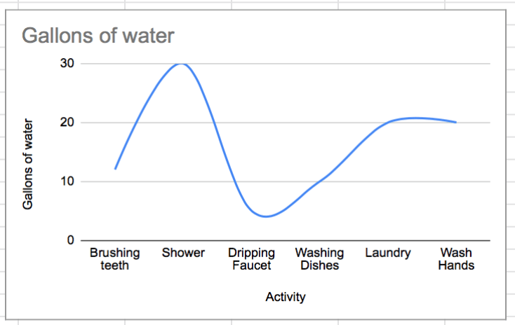
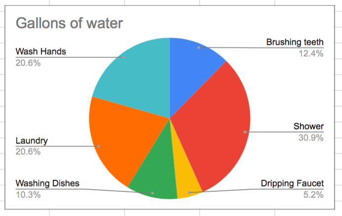
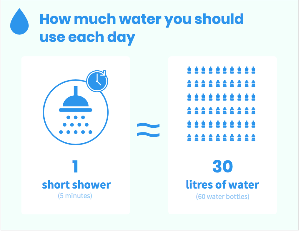
The connections that I had made in class to the homework was that on Monday we made bar graphs and pie charts to helps us solve the problem. The format that does the best job at conveying this information is definitely the bar graph and it shows a great representation of how much water and time I use throughout the day. The two that I compare it two is the pie chart and the bar graph. For my final Infographic I used “How Much water you should use each day.”I made it by using vengage along with the images that highlight the activity completed. It is visually being seen and very helpful to use for looking at how much water is being consumed each day. I think the pie chart is a bit complicated to explain and to look at. I think the bar chart is the best to look at because you can see how the numbers variation is totally different and how it goes up and down so that’s my personal preference is to use the bar graph to tell what and how much water consumption I use a day.
Links.
https://www.home-water- works.org/indoor-use/showers https://www.thebalancesmb.com/how-do-we-use-water-and-why-conserve-3157863 https://www.thebalancesmb.com/how-do-we-use-water-and-why-conserve-3157863 https://www.home-water-works.org/energy-water
